Choosing Subtle TheBurntPeanut Designs for Work
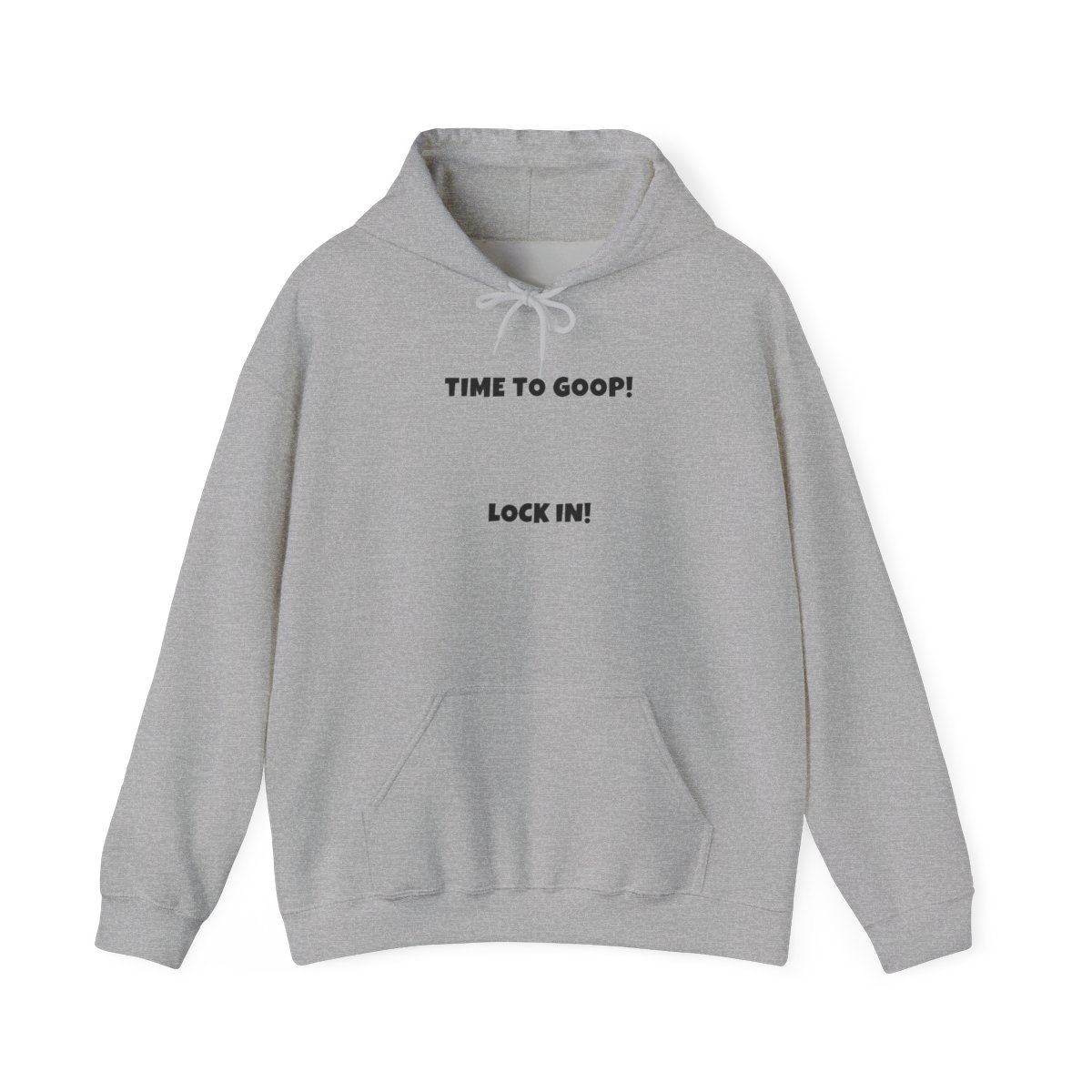
Not every piece in the store is office-ready. To blend in, look for items where the branding is understated. Think small logos, tonal embroidery, or minimal icons. TheBurntPeanut often releases limited drops with clean aesthetics - the classic "Peanut" script in a single color, or a tiny peanut icon on the sleeve or pocket.
What to Avoid
- Oversized back prints (save those for weekends)
- Bright neon colors or all-over patterns
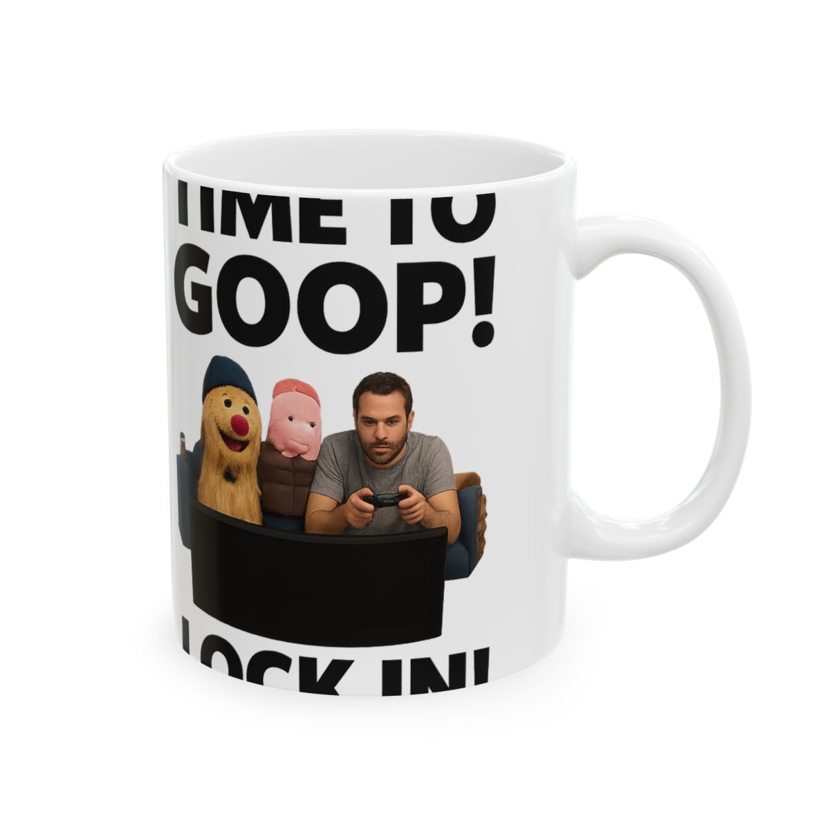
- Designs with explicit language or inside jokes that need explanation
Colors That Work
Neutral tones like black, navy, heather gray, and olive green are safe bets. They match most office pants and blazers. If you want a pop of color, choose a muted pastel or a dark jewel tone.
In my experience, the best TheBurntPeanut work attire pieces are those where a non-fan wouldn't even notice the branding. But another fan would spot it instantly. That's the sweet spot.